Brand Design that creates a Smile In The Mind
Recently, we had the opportunity to work on brand design with Lloyd from Carbon Market Advisory (CMA). CMA works with international clients from all over the world. It provides them with advice, recommendations and software intelligence. All this relates to the emissions based areas within their businesses. Lloyd and his team work closely with clients to support them with carbon knowledge and decision making advice.
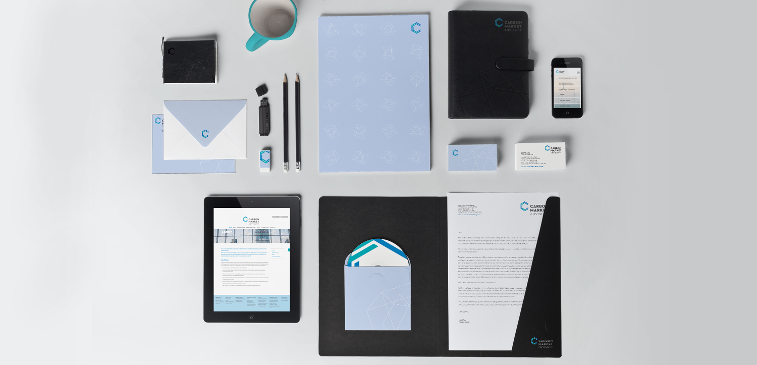
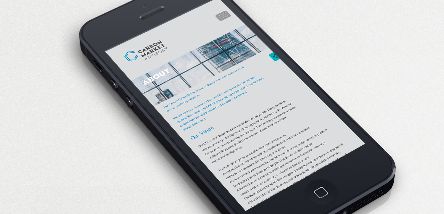
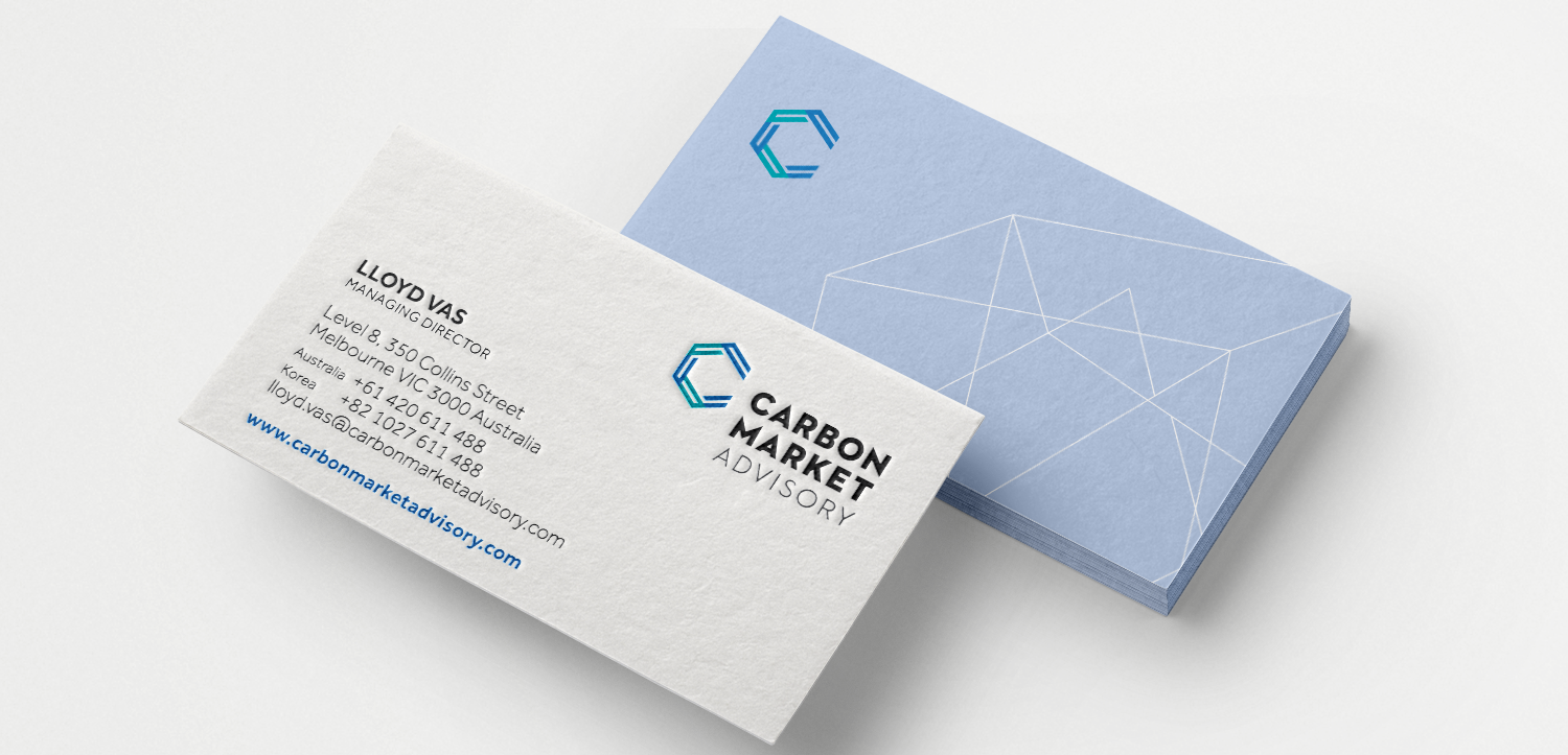
The brand design had to work across eastern and western markets. It couldn’t isolate either market. It was also key for the brand to look accessible and non-intimidating. However, it had to look professional and sleek enough to stand alongside logos of banking and corporate firms. When working on the brand design, we explored the atom version of carbon. It started to become a solid concept. By pushing this further and further we came to our final linear outcome. Making it work as a stand alone symbol meant that we had an icon we could reference. You will find it featured in the website and stationery designs.
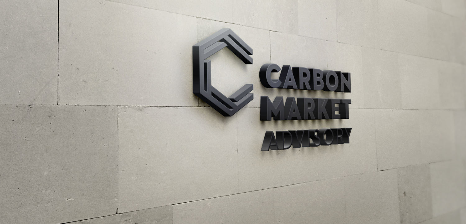
The lettering was kept clean and fuss free. The “C” to stands apart and work it’s magic (so to speak). It’s a logo that creates “A Smile In The Mind”. What I mean by that is that you could see it as a “C” for carbon and you can also see it as an atom shape for carbon. Brands like these are getting harder and harder to find. I am delighted with this to say that least!
We explored colour variations and came back to the soft blue, green and gray hues. Nothing quite like the quiet energy from those colours. They sit well with the brand mark and speak a lot about the nature of CMA.
Once the brief was wrapped up, we got a message from Lloyd showing us a picture of a trading floor which echoed the “C” in the brand design. TICK. TICK. TICK! Nothing quite as rewarding. You know it’s all fallen perfectly into place.


