We work with all kinds of businesses and different kinds of people – some who know design well, and others whose experience working with us will be their first ever exposure to the design process. Either way, we’ve become pretty good at hand-holding and we love taking the journey with a client to dig deep and uncover the heart and soul of their brand.
As a start-up nutrition and food counselling business, Food&Joy was entering the rapidly growing health and wellbeing industry where certifications are more of a bonus than a necessity and glossy photos of green apples with water droplets and posed food shots on white plates are the norm. Food&Joy needed a brand which looked different to the competition and felt true to itself – wholesome, accessible, and real.
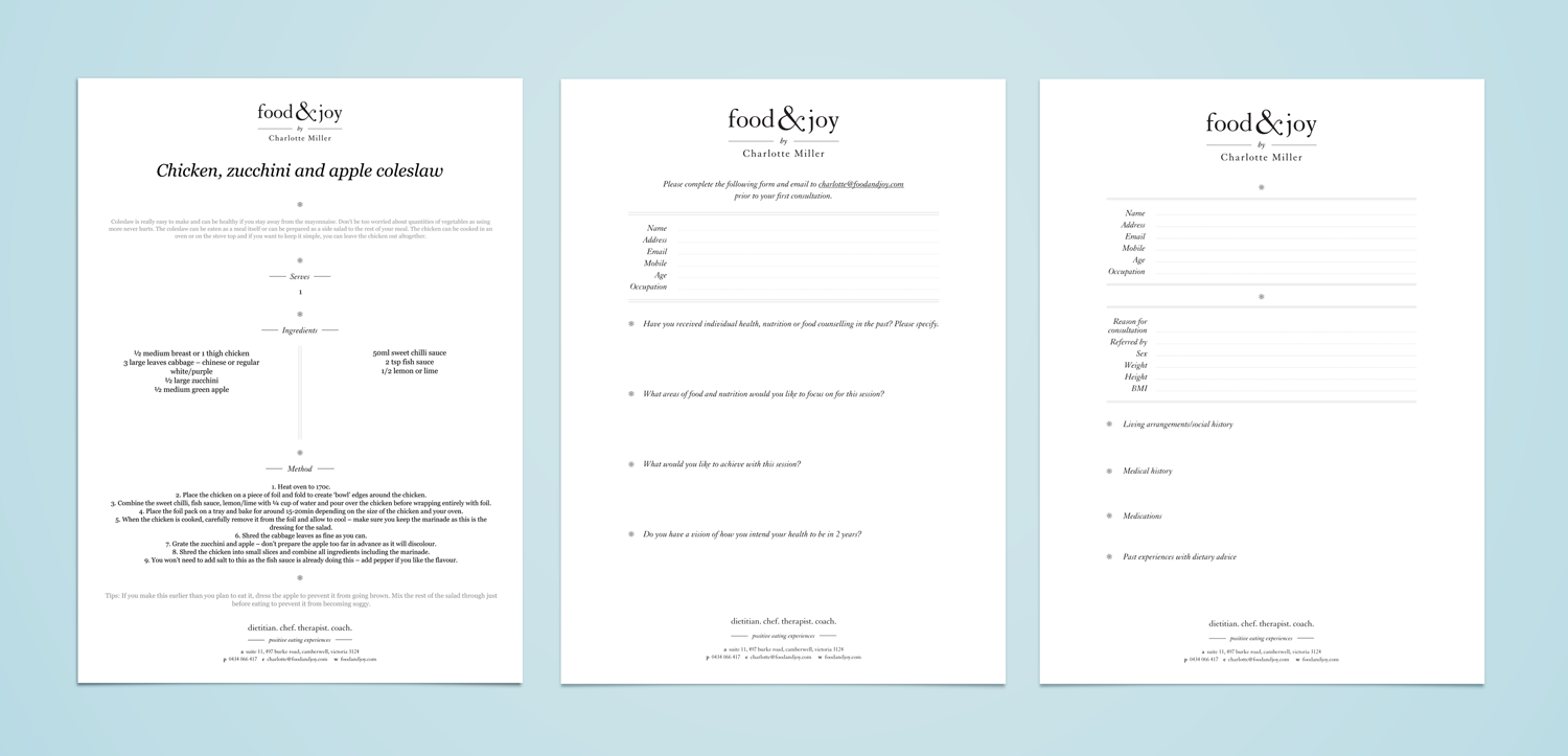
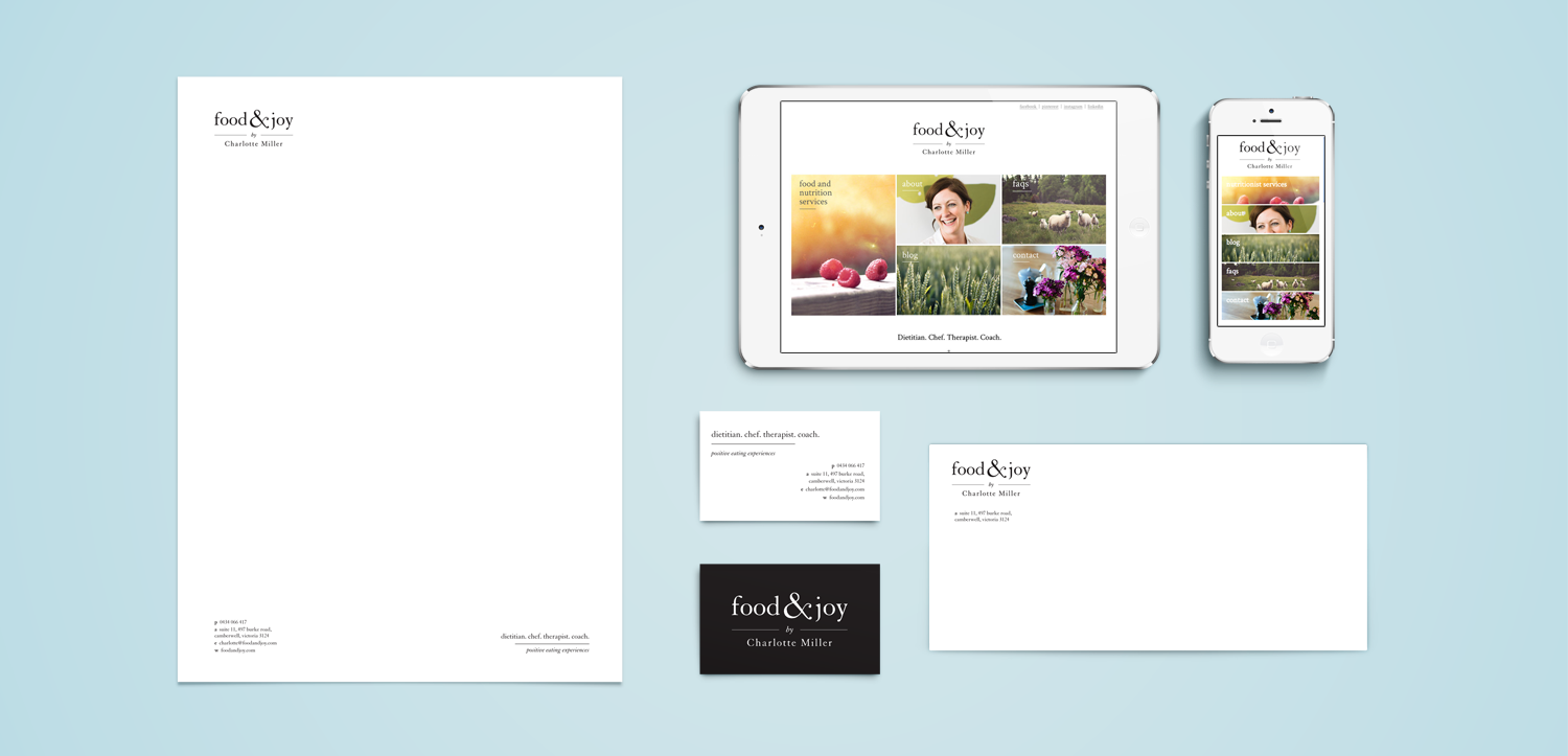
Based on the philosophy that real, simple food can be enjoyable while reducing our associated anxieties and still maintaining optimum health and wellbeing, we developed a clean and un-fussy logotype to reflect the simple, straightforward thinking of Food&Joy’s founder, Charlotte Miller. While we’d normally avoid the potential harshness of plain black on white, it worked perfectly to demonstrate the straight-up nature of the brand and bring a level of sleekness and sophistication.
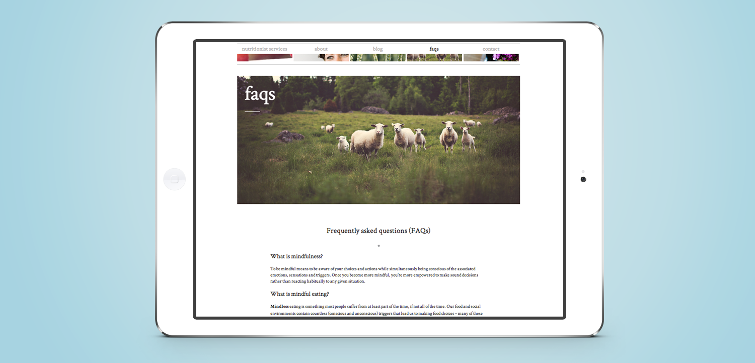
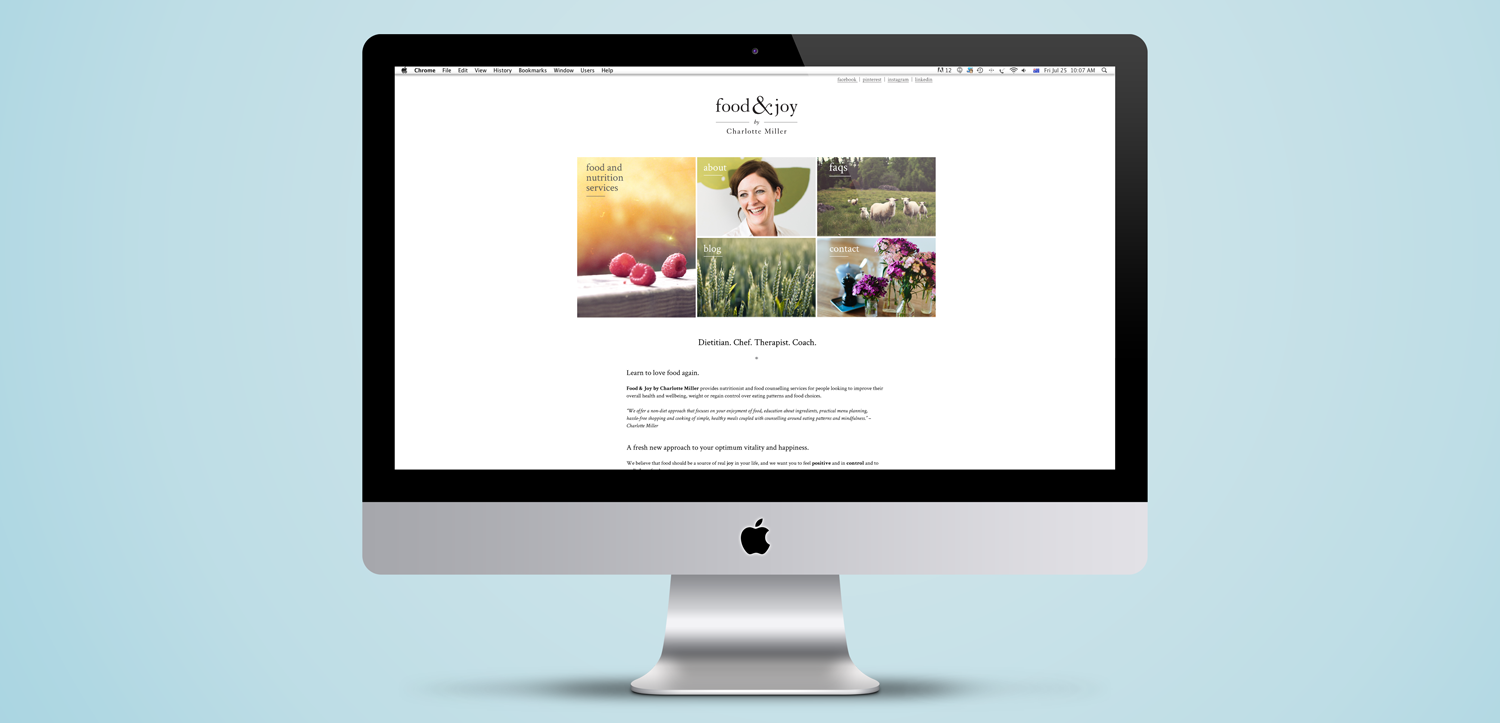
We worked with the very talented Bianca Cash to produce a suite of custom photography that captured the approachability and warm of Charlotte’s personality. Rich photography formed the basis for our website design which, like the brandmark, needed to be clean, modern and completely fuss-free.
Coupled with intuitive navigation, some clever little accents and a healthy amount of white space, Food&Joy’s website is a content-rich resource for potential clientele and a powerful first point of contact with the brand.
Bringing a brand to life and helping its owner develop and understand its personality, tone and all of its little quirks is a hugely rewarding part of the process and makes for a stronger visual identity and brand story throughout every touchpoint.

